Think about your most recent purchase.
Why did you purchase that specific brand? Was it an impulse buy or something you genuinely needed?
Now that you’re thinking about it, odds are, you bought it because it was interesting. Yes, you may have needed shampoo, but did you need that specific brand? The one with the sleek, expensive looking bottle? No, but you bought it because you thought it would make you feel fancy, even if it’s the same product as what’s in the discount bin.
This is the purpose of packaging. Packaging, when done correctly and creatively, is ultimately what sells your product. It draws attention, sends a message, and makes consumers feel a certain way.
Knowing how to make your product stand out amongst all the others on the shelves can be hard, so take a look at these 50 awesome packaging examples and tips to draw inspiration and learn how to make your packaging appeal to the masses.
01. Use Patterns

Use patterns to step up a simple take on packaging. This tool packaging is simple in structure, yet gets taken up a notch with the interesting striping on the background. The color scheme give it a quality, all-American feel, and the tools speak for themselves.
02. Consider All Available Space

When creating a package, utilize every inch that you can. This box uses a pretty floral pattern on the interior. Instead of leaving the inside untouched, the pattern makes the box feel more upscale, which, in turn, makes the product inside seem more upscale.
03. Don’t Be Afraid of Simplicity

Sometimes simplicity is key, and that holds true in this packaging. The earth toned, recycled material gives off an earthy feel, which is solidified with the feather illustration. The bright pops of color on the labels lend to the design nicely, bringing a bit more of a modern twist to the package.
04. Think About the Experience

Consider the actions a person will go through while interacting with your product. In this case, the product is luxury slippers. Since they’re a luxury item, they come inside a nice dust ruffle, which is then placed inside the box. The purchaser would open the box, see another package nestled inside, and then discover the slippers. The simple act of layering the package adds the luxury aspect, and makes it easier for purchasers to rationalize spending the few extra dollars for the experience.
05. Complement the Product

Make sure your design complements the product that’s inside. This packaging looks simple and natural, just like what’s inside. You can see all the parts and pieces that you’re getting before you purchase it, so it gives off the impression of transparency and being proud of what you’re selling.
06. Be Playful

If you have the opportunity to be playful with your packaging, take it. This packaging is incredibly playful, yet still simple. The illustration interacts with the product but still lets it shine through. The colors relate to the berries, and the act of the character eating the berries indicates their quality.
07. Be Bold

Using multiple colors and shapes in an interesting pattern is a great way to stand out. This tequila packaging utilizes these things, and has a very unique look. It looks fun and playful, and promises a good time if you choose it.
08. Break the Mold

If you have a product that a lot of other people produce as well, try to be innovative in how you display it. This honey package took a step in the opposite direction of the typical glass or plastic jar, and is a container made of beeswax. What’s even better, once you’ve used up all the product, you can flip the container over and reveal a wick on the bottom. You then burn down the package, making it completely waste free.
09. Consider the Process

If you’re product is something you believe to be gift worthy, display it that way. This limoncello was created to be a gift, and appropriately packaged. The white paper protects the glass bottle inside the tall cylinder. When you open the cylinder, you’re able to tear the paper away from the bottle, which is reminiscent of opening regular wrapped gifts.
10. Use Stylization

Don’t feel obligated to make your illustrations or graphics completely realistic. If you can stylize your imagery and use it as a textural element, go for it. This package uses a simple illustration of a head and hair. The hair moves throughout the box, creating a pattern in the background. At first glance, you don’t know what the pattern is making, but as you explore the package, you realize it’s been hair all along.
11. Don’t Limit Yourself

If your product is best coming in a certain type of package, don’t limit yourself to the basic idea. This soap is best coming in a box, but instead of just a regular box you open at one end, it folds open. The folding action makes it just that much more special and interesting, and makes it something worth saving and using for decorative storage.
12. Be Modern

Modern, sleek, and simple designs stand out. Use clean lines, simple colors, and sans serif fonts to achieve a modern look. This packaging took a very modern approach, and made it even more modern by making it gender neutral. It doesn’t lean one way or the other, and draws instant attention from viewers who are curious about who the product is for.
13. Use Texture

Instead of only using texture visually, use it physically. People will be physically interacting with your package, so appeal to their sense of touch, not just their sense of sight. This packaging for insect repellent uses texture at the bottom of their bottles. Not only does it help you keep a firm grip, but it adds an interesting sensation to your hands, and visually relates to the dotted imagery on the top area of the bottle.
14. Be Bright

If your product is brightly colored, draw inspiration from it. Use accents of the bright colors in your packaging, like this candy packaging. Each candy is a different color, and each bag uses the color of the candy on its sides and in the graphics. The line as a whole feels connected, but they’re just different enough that you can get the gist when a product is different than the next (without having to look at the candy).
15. Tell a Story

If you can tell a story with your packaging, you’re doing yourself a huge favor. People love stories, and they love uncovering information they may not otherwise. This packaging for socks tells a unique story. When you pull out the socks, a tuft of cotton is stuck to the top, replicating the smoke stacks that often were found on sock mills in previous years.
16. Stick to Your Roots

Analyze what your product stands for, and show that in your packaging. This beauty line stands for simple, all natural, and pure ingredients. They display that in their packaging. It is simple, clean, and looks natural. The earth toned box adds a nice flare to the natural aspect as well.
17. Be Creative

You can make your packaging cool, but if you can make your actual product cool, you’ve got a real winner. Take this milk soap, for example. It’s just soap made with milk, and could easily have been just another rectangular bar. But instead of doing what was expected, the soap was turned into an ice cream treat, related directly to the milk contained inside.
18. Consider the Interior

The outside of your package should be interesting, but what about the inside, where the product is actually encased? If you have multiple parts and pieces to your product, display them separately. This yoyo packaging has small cut outs for each piece of the yoyo, and they all fit neatly inside. The colors of the product relate to the colors on the box, and it pulls it together nicely.
19. Serve Another Purpose

Being eco-friendly is a great way to get people to love your brand. One way to be eco friendly is to give your product’s packaging another purpose. These bottles seem like normal enough cleaning products at first glance, but when you interact with them you realize they’re not made of flimsy plastic. They’re porcelain bottles, and are intended to be used as vases once the product inside is gone.
20. Play with the Senses

Try to appeal to every sense a human has in your packaging, if you can. The sense of touch is played up again in this sheet packaging. Small pieces were inserted inside the package before it was vacuum sealed, and it created a 3d, raised effect. It’s interesting not only to the eye, but to the hands as well.
21. Let the Product Speak

If you have a quality product, let it speak for itself. Don’t feel the need to surround it with shiny, obnoxious wrappings if it doesn’t need it. These tights are great quality and look great as well. Instead of hiding them away in a box, they’re front and center, allowing you to see how great they really are.
22. Limit Resources Used

Packaging costs you money, plain and simple. If you don’t need an excess of packaging, don’t use it. These music cords are packaged very simply, yet still effectively. The paper wrap is designed beautifully, with bright pops of gold on black, and the colors correlate with the colors of the products.
23. Give a Sneak Peak

Where food products are concerned, being able to see what it is you’re getting is incredibly important. Who knows what’s lurking in bags and boxes when you can’t see inside? These dog treats have a cut out window so you can see exactly what you’ll be feeding Fido. There won’t be any surprises once you get the product home, and you can tell that it’s quality just by looking at it.
24. Be Luxurious

If there’s one item people shell out tons of their hard earned cash on, it’s liquor. With so many brands out there, don’t you want to make sure yours stands out on the shelf? This liquor pulled out all the stops. It’s enclosed in a unique box, comes with shot glasses, and is an incredibly vibrant yellow and pink. It screams ‘good time’, and could be kept to display to commemorate a weekend well spent.
25. Use Restricted Colors

Limit your color palette to create a cohesive look. These rice cakes drew their color palette from the flavor, sea salt and balsamic, so it took on a nautical theme. The shades of blue work great together, and the complement of orange adds a nice pop.
26. Utilize the Product

If you can use your product as part of the actual package, do it. These shoes have awesome bird boxes, and instead of leaving the shoes just lay inside the box, the laces are strung through holes, giving the illusion of a worm in the bird’s mouth.
27. Be Trendy

Piggy back off of current trends to make your packaging more current. This beer uses the incredibly popular font not only as it’s branding, but as its namesake. It’s simple, clean, and modern, and looks slightly ‘hipster’.
28. Think Outside the Box

Or in some cases, in it. Break the conventions of what your product is ‘supposed’ to come in. Water typically comes in a plastic bottle. But this water comes in a cardboard box. it’s still just water, but it’s different than anything else on the market, and it’s sure to grab your attention.
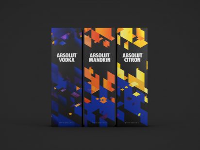
29. Use Interesting Imagery

Use imagery that is a little out there, something that isn’t expected. Luckily, the name of this vodka is a little out there, and the imagery could be pulled from that. The spine appears to be 3d the way it’s printed on the glass, and it gives an awesome effect.
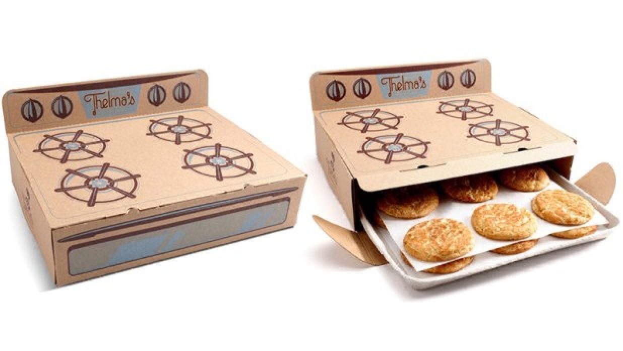
30. Be Literal

If your product is manufactured a certain way, try implementing it into your packaging. These cookies, for example, are baked in an oven. So why not package them in an oven? It’s a playful and approachable take on a standard bakery box, and it feels like a real treat.
31. Make it Relatable

Is there a common idea when it comes to your type of product? Try using it in your packaging to get universal understanding. This liquor bottle doesn’t only have an incredibly detailed label, but it has a funny brown paper over wrap. Everyone knows what it means, and everyone can get a bit of a chuckle out of it.
32. Include a Tactile Aspect

If your package is interactive, people will love it. This Smirnoff alcohol features a wrapper on the outside that you have to physically peel off. It also resembles the fruit in which the alcohol is flavored, and makes it feel more natural.
33. Be Weird

Make people uncomfortable if that’s your style. These juice boxes are very, very strange to look at. The resemblance of the actual fruit is uncanny, and seeing it in juice box shape makes you do a double take. It gives the impression that you’re drinking straight out of the fruit, and makes it seem healthier.
34. Use Humor

Being a little tongue in cheek with your packaging is fun. If you can make someone smile when they see your product, why wouldn’t you? These paint brushes act as facial hair for the illustrated faces on the sleeves. It’s fun to look at, and definitely stands out against other paint brush brands.
35. Don’t Be Afraid to Exaggerate

Exaggerate your shapes, colors, and illustrations when you can. This cereal brand uses a bear as its character (since it’s honey flavored). Instead of just having a picture of a cute bear, the bear has his mouth wide open, stuffing it full of the delicious cereal inside.
36. Turn it Into Something Else

Just because your product is one thing doesn’t mean it can’t look like something else, get creative with how your product can look. Instead of being a plain old tea bag, this tea brand turned the bags into ‘tea shirts’, complete with hanger. The hanger keeps the bag upright on the rim of your mug, making it functional and not just for aesthetics.
37. Make it What it is

Show what your product is made of in the packaging. This perfume (called Zen) is made with bamboo. Instead of using a bamboo print or illustration, the bottle is turned into bamboo. It becomes a real statement piece, and something someone would like to display.
38. Incorporate Beauty

People love beautiful things. Using and buying them make people feel good. Another interesting tea bag, though taken in a different direction, is this bird tea bag. It floats beautifully in your cup, as though it’s flying, and gives off an aura of serenity.
39. Get Ridiculous

Be extreme, ludicrous even. These Nike Air shoes aren’t packaged in a box, they’re packaged in – that’s right – a bag of air. It is so literal yet so creative. You have to get your hands on them, and it is incredibly effective.
40. Create Something With the Product

Use the product to create your imagery, but make sure it relates to what you’re selling. These headphones are used to create music notes. Since the notes aren’t printed on the paper, they’re 3d, and really add something extra to the flat piece of cardstock.
41. Be Risque

Being a little suggestive with your packaging can attract a different audience than you could have otherwise. This product is just regular bread, but the packaging portrays it as something else. The packaging is actually to promote breast cancer awareness, and it does a great job of attracting attention.
42. Be Morbid

Shock your consumers. This cigarette packaging is very shocking. It’s rooted in truth because smokers know the risks they take when they choose to light up. While it may not be the best marketing ploy, it certainly draws attention.
43. Push It

Be unorthodox with your packaging. As long as consumers can draw the connection between your product and what it’s packaged in, you haven’t gone too far. This vodka gel is packaged in a tube that resembles caulking. It’s an interesting way to get the product out, and it’s a fun play on industrial gels.
44. Address the Situation

Try to make a play on why someone would need your product. These earplugs do just that. The cap resembles the volume knob on a stereo, and the motion of taking the cap off ‘turns down’ the volume. The cap really isn’t blocking out the noise, the earplugs are, but it’s a fun twist.
45. Relate it to the Cause

Relate the imagery to your cause. This packaging is for a plant based digestive aid. It takes a stab at meats, and when the pills are popped out, it looks as though they’ve been shot in a shooting range. It goes with the slogan ‘target heavy food’, and gives the impression that it’s powerful.
46. Make it Something it’s Not

Make your product look like something else – just don’t get too drastic. Canned beer is cheap, but a lot of the time, the packaging isn’t too great. This beer is canned, but appears as though it’s in a special beer glass. The contrast between the lid and the rest of the ‘can’ creates an interesting effect, and makes the beer unique.
47. Use the Product to Your Advantage

Use the texture, color, or shape of the product to your advantage. This meat packaging uses the actual meat as a design element. The negative space in the animals reveals the actual product underneath, creating a contrast between how it began and how it is now.
48. Be Compact

If you can make something work just as well smaller, try it. The more compact something is, the easier it is to store and transport. These flashdrives are connected together by cardboard. The entire thing is only the size of a credit card, and easily fits into a wallet. If you need to give someone a file, you simply tear off a notch, load it, and hand it off. It’s convenient and reminiscent of those popular pull tab flyers.
49. Go Over the Top

Push your design as far as you can, you never know what interesting solutions you could come up with. Trident used the shape of their product to create teeth. Rather than just having the simple red lips, they added in funny mustaches and facial hair. It takes a unique idea and pushes it further.
50. Abstract It

Take your product and abstract it in your packaging. Rather than having just a regular small box of orange juice, the boxes are abstracted into ‘segments’ of an orange. They’re then wrapped up in a similar material that fresh bags of oranges come in and appear to construct an entire orange.
After seeing the limitless possibilities there are for making awesomely creative packaging, there should be no hesitation to push your product’s package to the max. It can be functional, repurposeful, entertaining, or just outright bizarre, but one thing’s for sure — the more creative and inspiring your packaging is, the more likely the product is to sell.
Source : www.designschool.canva.com